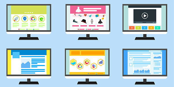

The only constant thing in the world is change. And so is designing trends. Check out some really cool web design trends that gain most traffic on the web.
A split-screen layout design is a perfect fit for a minimalist website. Splitting the screen into two distinct parts lets the user spend less time trying to find the information they are looking for. This decreases the bounce rate of the website and is helpful in generating more traffic.
Plus, it’s also a good choice for responsive frameworks because of the reduced clutter. But as you choose split-screen design keep your content simple so as it inspires your web design.
This trend is a refreshing way to start experimenting with customized digital graphics. Custom illustrations are relatively new design thing but they are really amazing. Whether it is storytelling through illustrations or animations, you get to introduce your brand to it. A custom illustration will make your web design unique and very appealing to the users.

Don’t get confused. Lazy loading doesn’t exactly mean slow loading.
Adding lazy loading on a website make it load faster, save bandwidth, and provide a truly uninterrupted browsing session. If users don’t scroll all the way down, images or content placed at the bottom of the page won’t even be loaded. So, when you move down on a web page, only then new information is revealed.
The Cinemagraphs trend adds new meaning to the website. As 90% of all information transmitted to our brains is visual. We remember 80% of what we see but only 20% of what we read.
Simply put, Cinemagraph is a rather “Story–doing” visual content that is used to increase and drive traffic to your blog or website. They can be high-quality videos or GIFs that run on a smooth, continuous loop. You gain greater dimension on what you’d like your audience to focus on.
The use of Geometry shapes in web design is one of the things that are never going to go out of trend. Its shapes and patterns bring variations and uniqueness in the web page design. It is a cool way to grab a lot of attention from the audience and you can put a sharp spin on your designs.
The design should be something that compliments the content. However, you have to exercise lots of caution while using these design layouts. As a single mistake can crush the whole idea of design.